CSS Flexbox for Responsive Designs
Posted By : Kiran Joshi | 30-Nov-2018
Flex as 'flexible' and box as 'container' is a beautiful approach to the responsive layouts. A container which adjusts its content with the change in device screens.
The display property has many values, you must have heard of inline, inline-block, block, and none. Let me introduce you to a very interesting value called flex, a value which changes many things for you.
Flexbox is another design technique that gives us arrangement control that no different CSS strategy can create. It exceeds expectations at 'miniaturized scale design': the capacity to adjust, arrange, and convey space among things in a compartment, or modify a component's width or stature to best fill the accessible space.
In Responsive Web Design, the width accessible differs as the viewport width changes sizes. This leads to unintended content wrapping, particularly when the content is longer than intended for or the space available is less to fit the div/containers.
Before Flexbox we used to work with CSS Media Queries to adjust layout at specific ranges(breakpoints) to resolve issues with content wrapping. Be that as it may, Media Queries don't consider the length of the content itself, they react to a specific width or height. This used to result in a lot of code to manage for different screen sizes.
Flexbox, on the other hand, solves this problem by empowering us to exploit the space accessible and afterward wrap content when it's most certainly not. This auto-change conduct isn't just helpful, however, enhances viability since we don't need to depend on breakpoint to physically modify the styling. The precedent above shows this conduct: show the area mark neighboring the title if enough space is accessible, and adjust the area name to one side beneath the title if adequate space isn't accessible.
	    .container {
  		display: flex; /* or inline-flex */
	    }
The flexbox container enables a flex context for all its direct children.
Below are the properties of Flex
1. Flex-direction, 2. Flex-wrap, 3. Justify-content, 4. Align-items, 5. Align-content
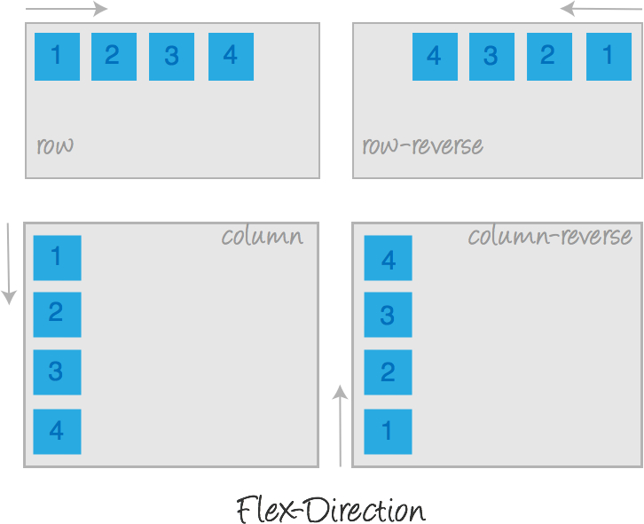
1. Flex-direction : defines the main-axis, thus defining the direction flex items are placed in the flex container. Flexbox is a single-direction layout concept. Consider flex things as primarily laying out either in horizontal rows or vertical columns.
	   .container {
  flex-direction: row | row-reverse | column | column-reverse;
}
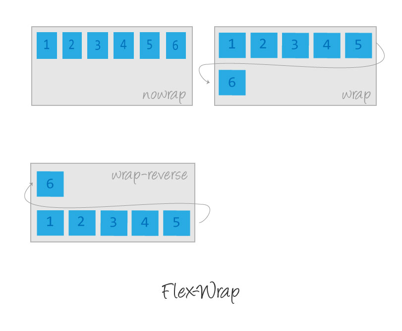
2. Flex-wrap : The default value of flex-wrap for class row is wrap so they will try to fit onto one line but you can change that and allow items to wrap as needed with following values.
	   .container{
  		flex-wrap: nowrap | wrap | wrap-reverse;
		}
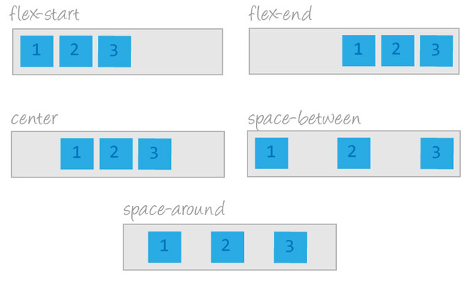
3. Justify-content : It disperses extra free space left over when either all the flex elements/items on a line are unbendable, or are flexible but have achieved their most extreme size. It likewise applies some power over the arrangement of things when they overflow the line.
	   .container {
  		justify-content: flex-start | flex-end | center | space-between | space-around | space-evenly;
	   }
4. Align-items : This defines the default behavior for how flex things are spread out along the cross axis on the current line. Consider it the justify-content version for the cross-axis.
	   .container {
  		align-items: flex-start | flex-end | center | baseline | stretch;
	   }

5. Align-content : This adjusts a flex container's lines within when there is additional space in the cross-axis, like how justify-content adjusts individual items within the main-axis.
	   .container {
  		align-content: flex-start | flex-end | center | space-between | space-around | stretch;
	   }

Source : https://cssreference.io/flexbox/


Request for Proposal
Cookies are important to the proper functioning of a site. To improve your experience, we use cookies to remember log-in details and provide secure log-in, collect statistics to optimize site functionality, and deliver content tailored to your interests. Click Agree and Proceed to accept cookies and go directly to the site or click on View Cookie Settings to see detailed descriptions of the types of cookies and choose whether to accept certain cookies while on the site.


About Author
Kiran Joshi
Kiran is a Frontend developer and have knowledge of HTML5, SASS, Bootstrap, and Javascript. She has working knowledge of ReactJs as well.