Google Analytics Charts Using Google Visualization Plugin (Part 1)
Posted By : Mohit Virmani | 26-Aug-2013
This is the first part of a 2 part series, the first part will describe the use of Google Visualization Plugin to display interactive Google Analytic Charts using the <gvisualization> taglib and the next part will be describing the development of same Charts using the plugins’ Under The Hood Code.
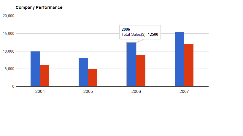
Shown below is a snapshot of the type of chart we are going to develop with the help of Google Visualization Plugin.
Also, you can take a look at the Charts Gallery to view the available charts by visiting here.
Now let's get started with the Analytics' charts, shown below are the steps and the code used to generate the same:
1. First create a new Grails Project,e.g., blogSample
2. Then you ned to install the google visualization plugin by the following command in grails:
install-plugin google-visualization
3. Next create a controller,e.g., columnChartController.groovy
package blogsample
class ColumnChartController {
def columnCharts = {
def defineDataTypeOfVariables = [['string', 'Task'], ['number', 'Total Sales($)'], ['number', 'Total Revenue($)']]
def salesExpenses = [ ['2004', '10000', '6000'],['2005', '8000', '5000'],['2006', '12500', '9000'],['2007', '15500', '12000']]
[defineDataTypeOfVariables : defineDataTypeOfVariables, salesExpenses:salesExpenses]
       }
}
This controller would be used to define the attributes of the charts as well as send the actual data to be displayed in the Charts. Here, the variables, defineDataTypeOfVariables defines the attributes of the data being sent, i.e.,Year,Total Sales and Total Revenue in this case; and other variable salesExpenses defines the actual data describing the values of Year, Total Sales & Total Revenue.
Here,in the first set of data, 2004 is the String defining Year, 10000 is the Total Sales & 6000 being the Total Revenue.
Also , to add another bar for Total Expenses, just add one more value to the 2 variables defined,e.g.
def defineDataTypeOfVariables = [['string', 'Task'], ['number', 'Total Sales($)'], ['number', 'Total Revenue($)'] , [‘number’ , ‘Total Expenses($)’’]]

def salesExpenses = [ ['2004', '10000', '6000' , ‘4000’],['2005', '8000', '5000' ,’3000’],['2006', '12500', '9000' ,’3500’],['2007', '15500', '12000' , ‘3500’]]
4. The last step would be creating a Groovy Server Page,e.g.,columnCharts.gsp
<html>
<head>
<script type="text/javascript" src="https://www.google.com/jsapi"></script>
</head>
<body>

<gvisualization:columnCoreChart elementId="barchart"   hAxis= "${new Expando([slantedTextAngle:'180',textStyle:new Expando(color:'black', fontName:'Arial', fontSize:14)])}"  bar= "${new Expando(groupWidth:'40%')}" chartArea="${new Expando(top:70, width:'100%' , height:'60%', left:50,bottom:150)}" title="Company Performance"  titleTextStyle="${ new Expando([color:'black', fontName:'Arial', fontSize:14])}" width="${700}" height="${400}" columns="${defineDataTypeOfVariables}" data="${salesExpenses}" />

<div id="barchart"></div>
</body>
</html>
To generate these charts, you’ll need to import the Google Visualization API JavaScript Library , which is done by adding the following JavaScript code to the head section to your GSP.
<script type="text/javascript" src="https://www.google.com/jsapi"></script>
The body of the gsp contains the visualization plugin's HTML code for generating and displaying the Google Analytics Charts. The visualization code has the following attributes:
- columnCoreChart : defines the type of chart used
- elementId : contains the ID of the div to be updated with the chart
- hAxis : customizes the horizontal axis
- slantedtextAngle : Controls the angle of the year displayed here
- fontName : defines the type of fontName of text on hAxis
- fontSize : defines the font size on hAxis
- bar : defines the group width between the bars displayed
- chartArea : Defines the total chart area.
- title : gives a title to the chart
- textStyle : Used to change the textStyle (e.g. Arial )
- color : Change the color of the text used
- columns : adds the columns, first one for year, rest onwards for no. of bars to be displayed
- rows : adds data to those columns
It renders the charts in the given div as follows:
<div id="barchart"></div>
Thus, given above is the technique used to develop Google Analytics Charts.
The above charts can also be customized with the help of the various customization options given below. You can customize various attributes of the above analytics like the type of chart ,height, width, etc..
For type of chart, the available visualizations are :
1. Interactive Charts(only requires a change in taglib):
- Pie Core Chart : <gvisualization:piecorechart>
- Bar Core Chart : <gvisualization:barcorechart>
- Bubble Core Chart : <gvisualization:bubblecorechart>
- Column Core Chart : <gvisualization:columncorechart>
- Area Core Chart : <gvisualization:areacorechart>
- Line Core Chart : <gvisualization:linecorechart>
- Scatter Core Chart : <gvisualization:scattercorechart>
- Stepped Area Core Chart: <gvisualization:steppedareacorechart>
- Candlestick Core Chart: <gvisualization:candlestickcorechart>
- Combo Core Chart : <gvisualization:combocorechart>
- Gauge : <gvisualization:gauge>
- Table : <gvisualization:table>
- Map : <gvisualization:map>
- Annotated Time Line : <gvisualization:annotatedtimeline>
- Organizational Chart: <gvisualization:orgchart>
- Intensity Map : <gvisualization:intensitymap>
- Geo Map : <gvisualization:geomap>
- Geo Chart : <gvisualization:geochart>
- Motion Chart : <gvisualization:motionchart>
- Tree Map : <gvisualization:treemap>
2. Image Charts:
- Pie Chart (Image) : <gvisualization:imagepiechart>
- Bar Chart (Image) : <gvisualization:imagebarchart>
- Area Chart (Image) : <gvisualization:imageareachart>
- Line Chart (Image) : <gvisualization:imagelinechart>
- Sparkline (Image) : <gvisualization:imagesparkline>
- Candlestick Chart(Image): <gvisualization:imagecandlestickchart>
Various other attributes are backgroundColor, hAxis, vAxis, toolTipText, etc..
Above shown are just a handful of attributes, whereas there are a lot of options available for customizing according to one’s need. Refer available options at https://developers.google.com/chart/interactive/docs/gallery/columnchart?csw=1
Thanks
Mohit


Cookies are important to the proper functioning of a site. To improve your experience, we use cookies to remember log-in details and provide secure log-in, collect statistics to optimize site functionality, and deliver content tailored to your interests. Click Agree and Proceed to accept cookies and go directly to the site or click on View Cookie Settings to see detailed descriptions of the types of cookies and choose whether to accept certain cookies while on the site.


About Author
Mohit Virmani
Mohit is a bright Vice President - Technology with deep technical expertise in Java , Spring , Grails etc.