Responsive Design Testing
Posted By : Mohd Sheemal | 27-Oct-2017
Responsive Design Testing :
Responsive web design is an approach where instead of creating design for each device. It create one design which is flexible and adjustable to all the devices so basically, It aim to one website which will work properly fine as a suppose to do and change is layout depending on the width of the browser on the device as used. Today we are living in a world we have all are using smart device which means any user can access every website from any where and every where so our clients for the devices they used we are testers must ensures there websites are responsive.
Test online website responsiveness :
'MobileTest.me' go to this website, so here we can just go to any of these devices. For example I will go to apple iphone5 and here I will just type the website address and click on go button, so you can see my website is now displayed on the apple iphone5
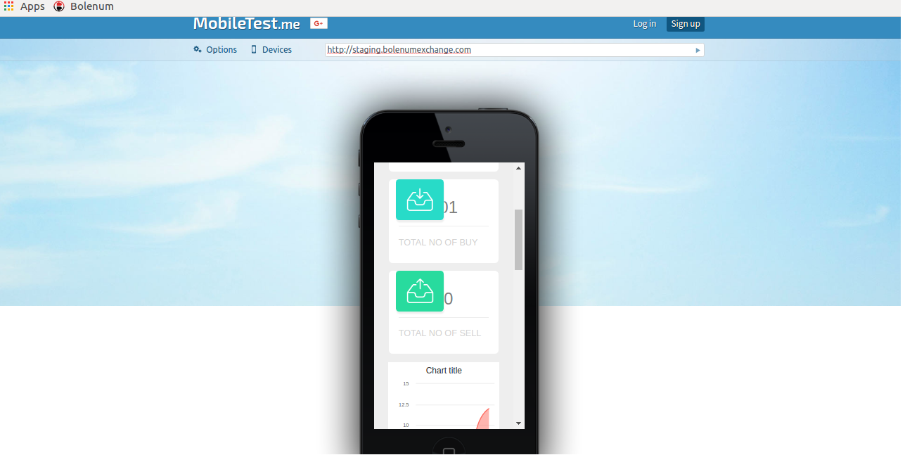
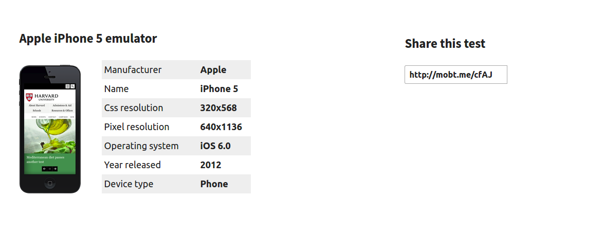
and If you go down you will find the description device and also you can share this test using this url, so now I can do a test on my website and see how exactly
It will behave and work on this particular device and also you can go to login, and login to this website then you will have a different features for example you will get a menu like this -
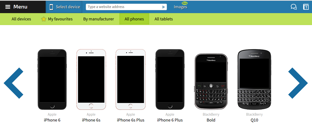
where you can select the device you can select by all the phones so any phone you can select and then all the tablets so for example again I will go to by phone and select iphone6 so you can see again my website get loaded on this device again
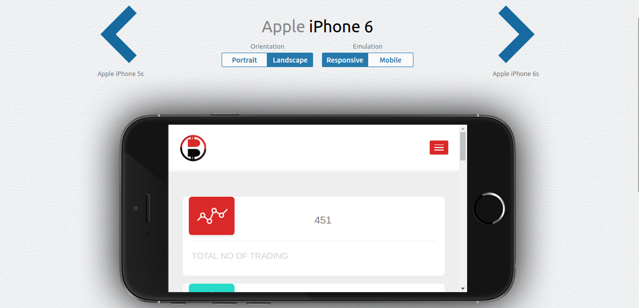
you have the details here and also you can do a landscape view and now I can just test my website and see how exactly. It will work and behave on this particular device.
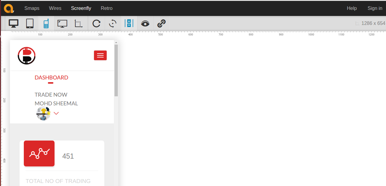
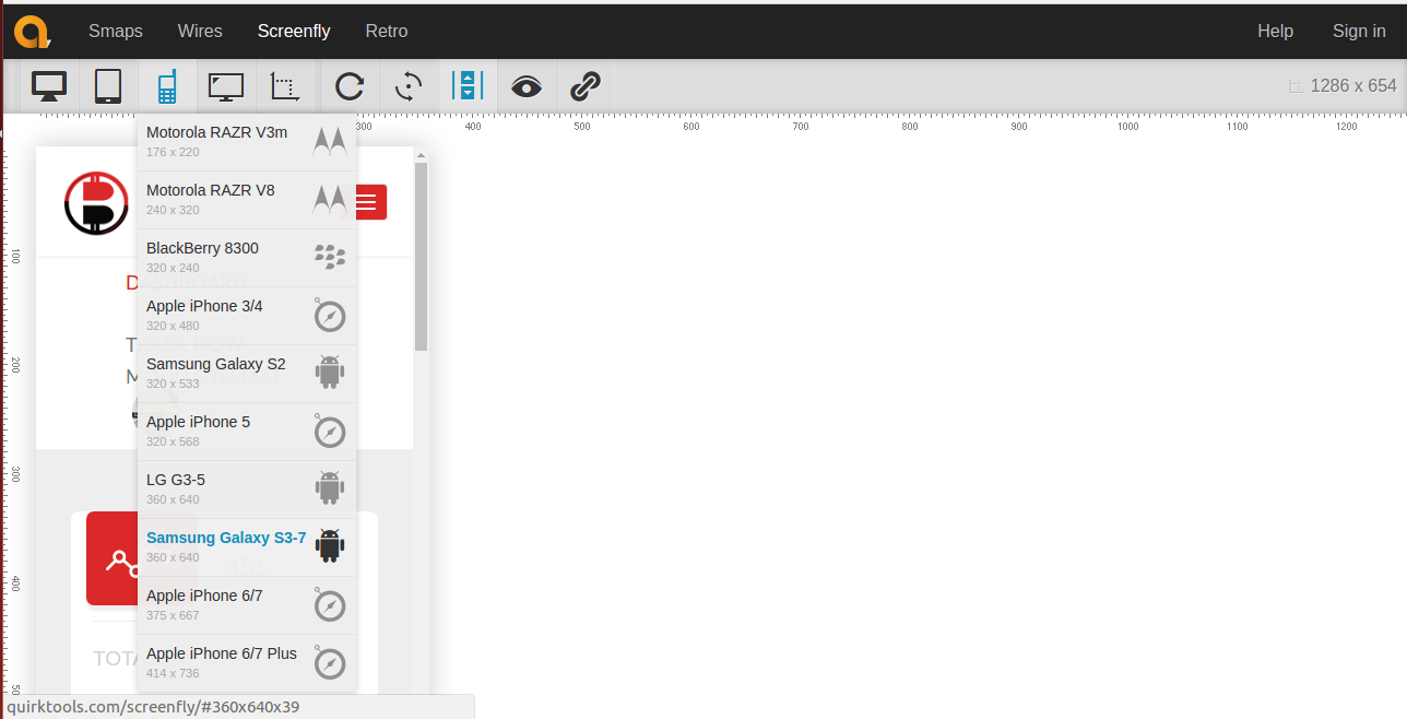
Then next free and open source option that we have called screenfly “quirktools.com” and just type your website address and click on go button and now you can see you have different options here , so you can click on tablet find a lot of options for tablets again you can click on mobile and
again a lot of options for mobile you can click on any of the mobile device and you can see the screen has changed Now you can do your testing also the good thing
here is you have this option to customise your screen size so you can click here and you can give any screen size here
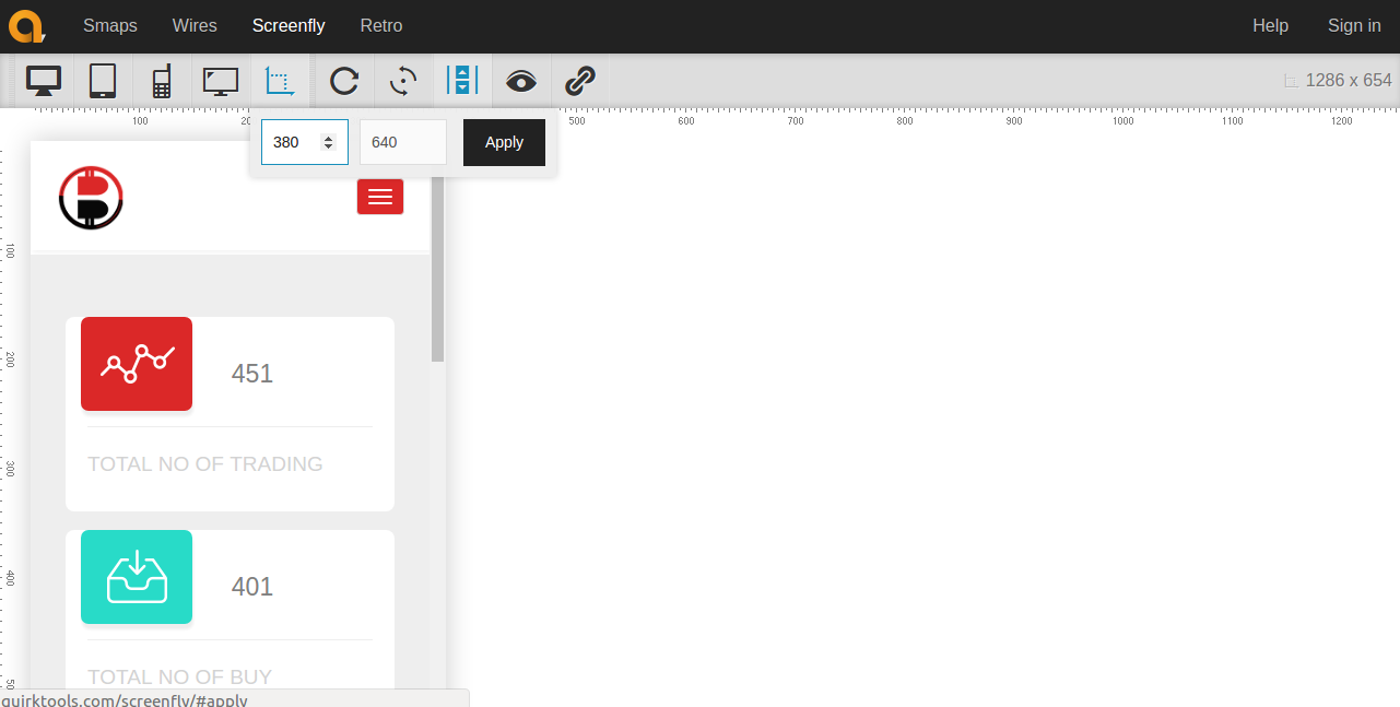
So if I say the apply you can see the screen size has changed and now that particular resolution and screen size you can do your testing so this will be very handy and very useful.


Cookies are important to the proper functioning of a site. To improve your experience, we use cookies to remember log-in details and provide secure log-in, collect statistics to optimize site functionality, and deliver content tailored to your interests. Click Agree and Proceed to accept cookies and go directly to the site or click on View Cookie Settings to see detailed descriptions of the types of cookies and choose whether to accept certain cookies while on the site.


About Author
Mohd Sheemal
Mohd Sheemal is a Bright QA Engineer. He has a good knowledge over Selenium.