PAINTER WIDGET in NETGEM
Posted By : Gaurav Tiwari | 14-Feb-2014
I am going to explain about how to use Painter Widget and configure by different option.
we need to create the html file such as index.html
When we start the application ,there is NGM.application.start() method call.it start the application and initiate the main form.
copy the following code in index.html
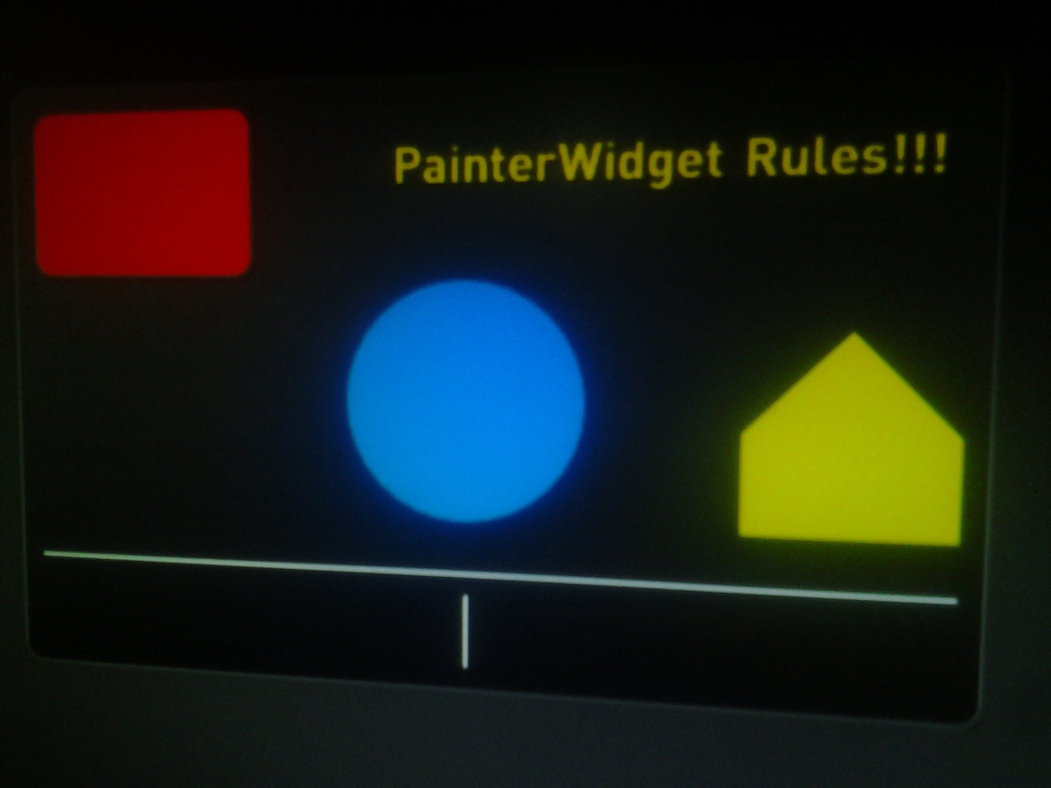
Then myformwidget constructor called and set the image and shape of the component. and OnEnter method called to enter the application and display the screen. main thing is used to myFormWidget.json and thema.json . and myFormWidget.json of the painter Widget ,we use to draw the shape ,size on the screen. there are five element are used in the painter widget.these are 2 rectangle,circle,polygon, one textual area ,horizontal line and vertical line.
Below shown is the overview of the Display Screen.
"comboPainter": {
            "create": "PainterWidget",
            "param": {
                "elements": [
                      // rectangle that occupies the whole Painter area
                      {
                          "type": "rect",
                          "bounds": {"x":0,"y": 0,"w": 400,"h": 250},
                          "custo": "custoPanel"// there is no relevant to js code ,it's map in Thema.json file of application
                      },
                      // red rectangle
                      {
                          "type": "rect",
                          "bounds": {"x":10,"y": 10,"w":100,"h":70},
                          "custo": "custoRedR"
                      },
                      // blue circle
                      {
                         "type": "circle",
                         "bounds": {"x":150,"y": 80,"w": 100, "h": 100},
                         "custo": "custoBlC"
                      },
                      // yellow polygon
                      {
                          "type": "polygon",
                          "coords": [310,180, 310,140, 350,100, 390,140, 390,180],
                          "custo": "custoYlP"
                      },
                      // text area
                      {
                          "type": "text",
                          "value": "PainterWidget Rules!!!",
                          "bounds": {"x":170, "y": 20,"w": 220, "h": 30},
                          "custo": "custoText"
                      },
                      // horizontal separator (top of the bounding box)
                      {
                          "type": "separator",
                          "bounds": {"x":10,"y": 200,"w": 380, "h": 20},
                          "custo": "custoSeparator"
                      },
                      // vertical separator (left of the bounding box)
                      {
                          "type": "separator",
                          "bounds": {"x":200,"y": 210,"w": 20, "h": 30},
                          "custo": "custoSeparator"
                      }
                ],
                "options"   : [
                      "tmpBuffer", // it indicate all the graphical element are drawn in temporary buffer and then displayed on screen
                      "autopaint" // it call to setData() automatically
                ],
                "autoload":true,//The "autoload" parameter forces the creation of the widget on parent form creation.
                "zIndex"    : 1,
                "speed"     : 300,
                // "bounds" specifies that an "enter" and an "exit" states will be created
                "bounds"    : {"x": 100, "y": 100, "w": 400, "h": 250},
                "defaultState"  : "enter"
            }
        }
myThema.json is used design and increase the look and feel as the painter widget.
Widgets customization is based on an inheritace mechanism, represented by the <@ symbol.
and each field relate to the painter widget of the custo field. and copy the following code into myThema.json
        "comboPainter": {
             "custoPanel<@panel": {},
             "custoRedR<@panel": {
                 "fill": "#FF0000"
             },
             "custoBlC<@panel": {
                 "fill": "#0078FF"
             },
             "custoYlP<@panel": {
                 "fill": "#FFDE00"
             },
             "custoText<@title": {
                 "font_size": 20,
                 "fill": "#FFDE00"
             },
			 // it is used to for the separate line horizontal and vertically.
             "custoSeparator<@separator": {}
      },
Thanks Gaurav Tiwari


Cookies are important to the proper functioning of a site. To improve your experience, we use cookies to remember log-in details and provide secure log-in, collect statistics to optimize site functionality, and deliver content tailored to your interests. Click Agree and Proceed to accept cookies and go directly to the site or click on View Cookie Settings to see detailed descriptions of the types of cookies and choose whether to accept certain cookies while on the site.


About Author
Gaurav Tiwari
Gaurav is a bright Java and Grails developer and have worked on development of various SaaS applications using Grails framework.