Animated hamburger menu with HTML and CSS
Posted By : Milind Ahuja | 13-Jun-2017
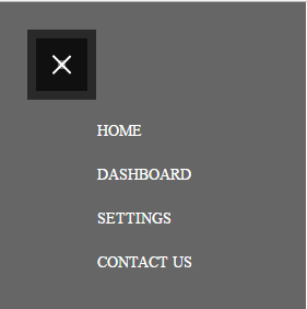
Hamburger menu icons have become famous in many websites and web apps. A large menu can be displayed just by clicking the button. Its compact and due to it's space saving nature, they have become most popular UI element, especially on smaller screens. So if you are looking for new ways to animate those three lines in to a neat X, check out the following Code.

MARK UP :
This input type checkbox will give the toggle behavior, it will be hidden, but functional
Any element that we want to modify when the checkbox state changes go here, being "sibling" of the checkbox element
The following label is tied to the checkbox, and it will contain the toggle "buttons"
If the menu is shown, this will change to the 'X' icon, otherwise it will behave just as a clickable area behind the hamburger menu icon
Now comes our Navigation menu
CSS :
     /* Toggle functionality */

#toggle {
    position: absolute;
    left: -100%;
    top: -100%;
    opacity: 0;
}

label.toggle-container {
    display: inline !important;
}

#toggle:focus ~ .toggle-container .button-toggle {
    box-shadow: 0 0 0 0px rgba(12, 28, 38, 0.65), inset 0 0 0 24px rgba(12, 28, 38, 0.65);
}

/* Styles for the 'open' state, if the checkbox is checked*/

/* Any element you need to change the style if menu is open goes here, using the sibling selector (~) as follows

Making the "X" icon using `:before` and `:after` pseudo-elements */

#toggle:checked ~ .toggle-container .button-toggle {
    box-shadow: none;
    width: 23px;
    right: 10px;
}

#toggle:checked ~ .toggle-container .button-toggle:hover {
    box-shadow: none;
}

#toggle:checked ~ .toggle-container .button-toggle:before {
    transform: translateY(-50%) rotate(45deg) scale(1);
}

#toggle:checked ~ .toggle-container .button-toggle:after {
    transform: translateY(-50%) rotate(-45deg) scale(1);
}

#toggle:checked:active ~ .toggle-container .button-toggle {
    box-shadow: 0 0 0 550px rgba(0, 0, 0, 0.1), inset 0 0 0 20px rgba(0, 0, 0, 0.1), 0 0 0 8px rgba(0, 0, 0, 0.1), inset 0 0 0 20px rgba(0, 0, 0, 0.1);
}

#toggle:checked ~ .nav {
    margin-bottom: 100px;
    pointer-events: auto;
    transform: translate(0px, 50px);
}

/* Restoring nav items from "lines" in the menu icon */

#toggle:checked ~ .nav .nav-item {
    color: #fff;
    letter-spacing: 0;
    height: 40px;
    line-height: 40px;
    margin-top: 0;
    opacity: 1;
    transform: scaleY(1);
    transition: 0.5s, opacity 0.1s;
    font-size: 32px;
    font-family: AvantGardeBookBT;
}

/* Setting delays for the nav items in open transition */

#toggle:checked ~ .nav .nav-item:nth-child(1) {
    transition-delay: 0.15s;
}

#toggle:checked ~ .nav .nav-item:nth-child(1):before {
    transition-delay: 0.15s;
}

#toggle:checked ~ .nav .nav-item:nth-child(2) {
    transition-delay: 0.1s;
}

#toggle:checked ~ .nav .nav-item:nth-child(2):before {
    transition-delay: 0.1s;
}

#toggle:checked ~ .nav .nav-item:nth-child(3) {
    transition-delay: 0.05s;
}

#toggle:checked ~ .nav .nav-item:nth-child(3):before {
    transition-delay: 0.05s;
}

#toggle:checked ~ .nav .nav-item:nth-child(4) {
    transition-delay: 0s;
}

#toggle:checked ~ .nav .nav-item:nth-child(4):before {
    transition-delay: 0s;
}

#toggle:checked ~ .nav .nav-item:before {
    opacity: 0;
}

#toggle:checked ~ .dummy-content {
    padding-top: 30px;
}

#toggle:checked ~ .dummy-content:before {
    background-color: rgba(0, 0, 0, 0.3);
}


/* Toggle button */

.button-toggle {
    position: absolute;
    display: inline-block;
    width: 47px;
    height: 48px;
    margin: 11px;
    background-color: transparent;
    border: none;
    cursor: pointer;
    border-radius: 0;
    transition: 0.6s;
    right: 0;
    top: -10px;
    box-shadow: 0 0 0 0px rgba(12, 28, 38, 0.65), inset 0 0 0 24px rgba(12, 28, 38, 0.65);
    -webkit-backface-visibility: hidden;
}

.button-toggle:before,
.button-toggle:after {
    position: absolute;
    content: '';
    top: 50%;
    left: 0;
    width: 100%;
    height: 2px;
    background-color: #ffffff;
    border-radius: 5px;
    transition: 0.5s;
}

.button-toggle:before {
    transform: translateY(-50%) rotate(45deg) scale(0);
}

.button-toggle:after {
    transform: translateY(-50%) rotate(-45deg) scale(0);
}
THANKS


Cookies are important to the proper functioning of a site. To improve your experience, we use cookies to remember log-in details and provide secure log-in, collect statistics to optimize site functionality, and deliver content tailored to your interests. Click Agree and Proceed to accept cookies and go directly to the site or click on View Cookie Settings to see detailed descriptions of the types of cookies and choose whether to accept certain cookies while on the site.


About Author
Milind Ahuja
Milind is a bright Lead Frontend Developer and have knowledge of HTML, CSS, JavaScript, AngularJS, Angular 2+ Versions and photoshop. His hobbies are learning new computer techniques, fitness and interest in different languages.